Layouts are pre-designed templates that make it easy to arrange images, text and decorative elements in your photo product. They are designed to streamline the design process and can be customised to suit your needs. Depending on the design line you choose, layouts may include backgrounds and cliparts. To access the Layouts menu, click the Layout button on the right.

The Layout menu provides a selection of layouts based on the number of images already placed on the photo product. Clicking on Design Line will bring up a menu with several design line options to choose from. These can be filtered by category using the box at the top left. Once you have selected one, click on Continue. For multi-page products, there is an option to apply the design line to all pages using the To all pages button. The Layout menu will then present a number of layouts with different design elements. You have the flexibility to change the design line at any time.

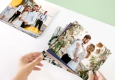
To explore layouts with different numbers of images, scroll down the right hand menu. You can also filter the layouts by the number of images by opening the images per page menu and selecting the desired number. Once you have selected a layout, it will be added to the photo product with empty image boxes. To add images, drag them from the menu on the left, or click on an image box and select a photo from your device or online resources. Photos already placed on the photo product will automatically adjust to fit the layout.

By default, the first layout options shown in the right column are based on the number of photos already placed in the photo product, if the Image per page option is set to variable. For example, if there are three images in the photo product, layouts with three images will appear first in the right-hand menu. To filter the layouts based on the number of images, open the Image per page field and select the desired number. Once placed, layouts can be mirrored horizontally by clicking on the Mirror layout button at the top of the Layouts menu.

You can do this by clicking the Add text button in the top menu of the Online Designer or at the top of the Layout menu. Once you have added text, the layout options will include a text box. Click on the layout you want to apply to your photo product.

If you add a second text by clicking Add text again, the Layout menu will display options with two text boxes. Select the layout that best suits your design.

To customise the text, select the text box and click the Text editor button. See the Text article for more information.
Below each layout is a heart icon. Clicking on the heart icon turns it grey, indicating that the layout has been marked as your favourite. Favourite layouts are conveniently displayed at the top of the Layout column when the number of photos placed on the photo product is equal to or less than the number of image boxes within the favourite layout. This gives you quick access to your favourite layouts. To remove a layout from your favourites, simply click the heart icon again.

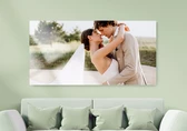
Selecting a layout from the right-hand menu places the objects of the selected layout in the photo product. These objects can be easily repositioned and customised to suit your needs. For example, if you want to change the clipart that came with the selected layout, you can simply delete it and select another from the clipart menu. You also have the flexibility to add frames to images or include additional objects such as fill boxes to act as a background for a single page.

Get exclusive discounts and designing tips! By signing up, you acknowledge our Privacy Policy. You can unsubscribe at any moment.


 Change your country
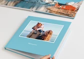
