Creating exceptional Wall Art that truly captures the impact of your photography requires more than just great image composition. The difference between good wall art and extraordinary Wall Art often comes down to understanding how your images translate from screen to print.
The key to consistently delivering outstanding Wall Art lies in understanding the specific requirements of print production. By following these five essential preparation steps, you ensure every piece you create meets the highest professional standards while maximizing the visual impact your clients expect.
Sharpness forms the foundation of professional Wall Art, but it requires a fundamentally different approach than screen optimization. What appears perfectly sharp on your monitor may lack the precision needed for large-format printing, where every detail becomes magnified.
Apply sharpening after final sizing. Never sharpen before cropping and resizing your image to its final print dimensions. Applying sharpening to a different size and then scaling can produce unpredictable results that compromise print quality.
Always evaluate at 100% zoom. Other zoom levels can mask or exaggerate sharpening effects. What looks ideal at 50% zoom might reveal harsh artifacts when viewed at actual pixels - artifacts that will be clearly visible in your final print.
Use targeted sharpening with masks. Apply sharpening selectively to areas that benefit most while preserving the natural softness of skin, skies, and backgrounds. This creates a more professional, balanced result.
Excessive sharpening creates bright halos around high-contrast edges that may go unnoticed on screen but become obvious in print.
An image may appear properly exposed globally while having critical areas - faces, skies, or important details - that are too dark or too bright for optimal print reproduction.
Focus on key zones first. For portraits, ensure skin tones fall within the optimal luminance range (typically 40-70%). In landscapes, pay special attention to sky detail and foreground shadows. These areas draw the viewer's attention and must be perfectly exposed.
Use selective adjustments. Apply masks, gradients, or brush tools to adjust exposure only where needed. Raise shadows in portraits without affecting highlights, or control sky brightness without impacting the rest of your composition.
Match exposure to your subject matter. Portraits and soft scenes benefit from restrained, gentle exposure that preserves emotional tone. Landscapes and architectural work can handle more balanced, full exposure to maximize visual impact and detail retention.
Professional Wall Art requires carefully controlled contrast that maximizes visual impact while preserving detail throughout the tonal range. The goal is rich, dynamic images without sacrificing information in shadows or highlights.
Read your histogram carefully. Avoid crushed blacks (completely black areas with no detail) and blown-out highlights (pure white with no information). These areas lose all texture and appear flat in print, particularly on matte papers that naturally have lower contrast.
Maintain a wide but controlled tonal range. Aim for deep blacks, clean whites, and rich midtones while preserving texture throughout. This is especially critical for matte and fine art papers, which absorb ink differently than glossy surfaces.
Use the luminance channel for evaluation. Temporarily convert your image to black and white or isolate the luminance channel. This helps you detect subtle contrast issues without color distraction and spot potential problems like light bleed or distracting halos.
Professional color management goes beyond global adjustments. Individual color channels often contain hidden issues that affect print quality - color casts, clipping, or tonal imbalances that aren't visible when viewing the composite RGB channel.
Examine each channel independently. Don't rely solely on the composite RGB view. Individual red, green, or blue channels may have clipping or unwanted color casts, especially in mixed lighting conditions or complex skin tones.
Balance channels for neutral prints. Use Levels or Curves to correct each channel separately. This helps eliminate color casts in shadows (often greenish) or highlights (frequently magenta-tinted) that become more pronounced in print.
Enhance chromatic contrast naturally. Channel-by-channel adjustments allow you to boost perceived contrast and tonal separation without introducing artificial saturation or posterization. This technique is particularly valuable for portraiture and product photography where color accuracy is paramount.
ICC profiles serve as the crucial bridge between your digital file and the physical print, ensuring colors reproduce as accurately as possible on your chosen medium. However, timing and application method are critical for optimal results.
Edit in wide colour spaces. Work in AdobeRGB or ProPhoto RGB throughout your editing process. These color spaces contain a much broader range than sRGB, preserving tonal subtleties and richer saturations that are essential for high-quality Wall Art.
Apply print profiles only for soft proofing. Never apply the ICC print profile for your image exporting. This can clip your tonal range prematurely and cause unwanted color shifts. Use the profile for proofing to assess how colors will render, then remove it before the final export.
Soft proof with the correct paper profile. Each paper type responds differently to ink. Use the specific ICC profile for your chosen medium during soft proofing to identify potential color shifts, particularly in challenging areas like pink or vibrant greens.
Implementing these five essential checks creates a systematic approach to Wall Art excellence. By addressing sharpness, exposure, contrast, levels, and ICC profiles in the correct sequence, you ensure every piece meets the exacting standards your clients expect from professional photography.
Quality begins with the right partner. At Saal Digital, we combine 40+ years of printing expertise with cutting-edge technology to ensure your preparation work translates into stunning results. Our ICC profiles and premium materials are specifically designed to support the professional standards you maintain.
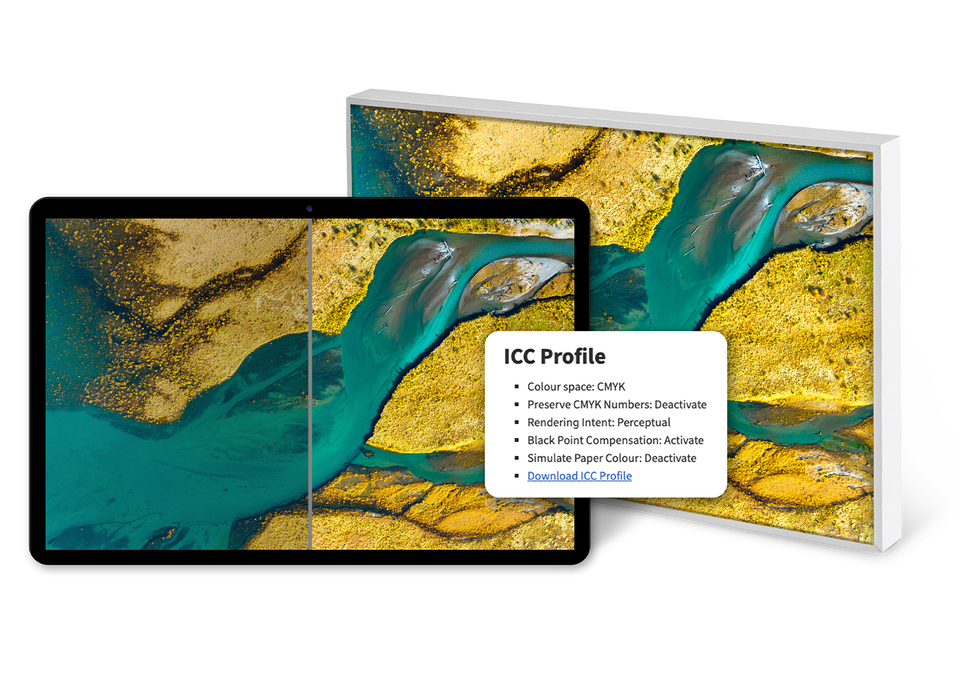
Precision-matched ICC profiles for every product. We provide specially developed ICC profiles for all our photo products, precisely calibrated to each specific material and surface. This ensures accurate and consistent color reproduction that matches your intended results exactly.
You can also download the complete ICC profiles as a convenient ZIP file download.

We prioritize our customers and consistently try to offer the best solution for them.

We are committed to delivering the highest quality in everything we do.

We do not compromise on data security, especially for our customer’s personal data.

We believe that the key to delivering exceptional products lies in the power of collaboration.

Efficient processes enable us to deliver high-quality products swiftly.

From software development to production — we ensure unparalleled quality, consistency, and innovation

Get exclusive discounts and designing tips! By signing up, you acknowledge our Privacy Policy. You can unsubscribe at any moment.